Webinar Walkthrough
Introduction
After 12 months of development, we are proud to announce the latest release of Schoolbox. With mobile devices and touch screens becoming the predominant devices, we believe it is now time to deliver an interface that recognises these trends and puts them at the forefront of the Schoolbox experience.
With this release we completely went back to the drawing board to reassess our interface and how it was used on a range of different devices. This was done over a 3 stage process the covered design, framework and then implementation. The process required every page in Schoolbox, some 400+ pages to be rebuilt. This massive undertaking is in line with our commitment to maintain Schoolbox and the forefront of the latest technology and usability.
Major Features
Mobile First
In previous versions of Schoolbox a separate mobile interface that contained a subset of functionality existed. This reduced functionality and duplicated interface limited our mobile users and created additional overhead for our development team. For 15.5 we wanted to combine mobile and desktop into a single interface so we could share all the great Schoolbox functionality no matter what your device.
This required a mobile first mentality where all interfaces must first be designed to work on mobile and then expanded to work on desktop. This focus on mobile first also provided the opportunity to streamline interfaces, remove excess complexity and reassess navigational elements. This has all results in a simplified experience across all devices, while still maintaining our functionality and power.
Navigation Upgraded
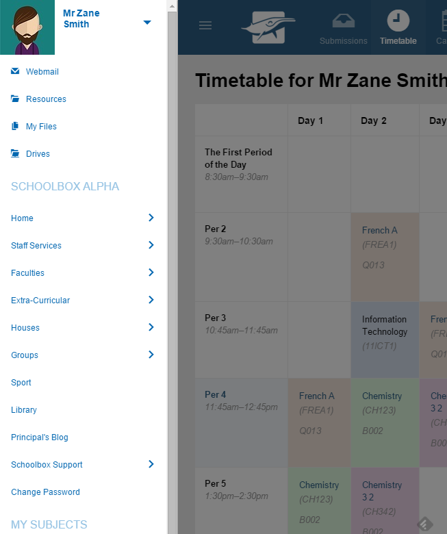
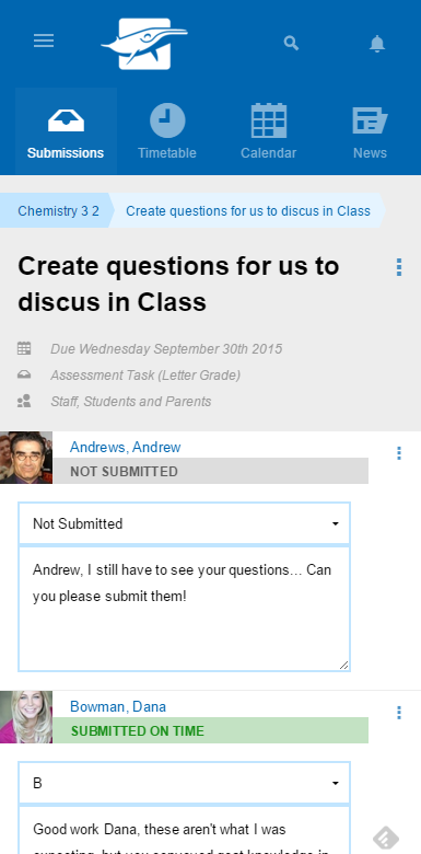
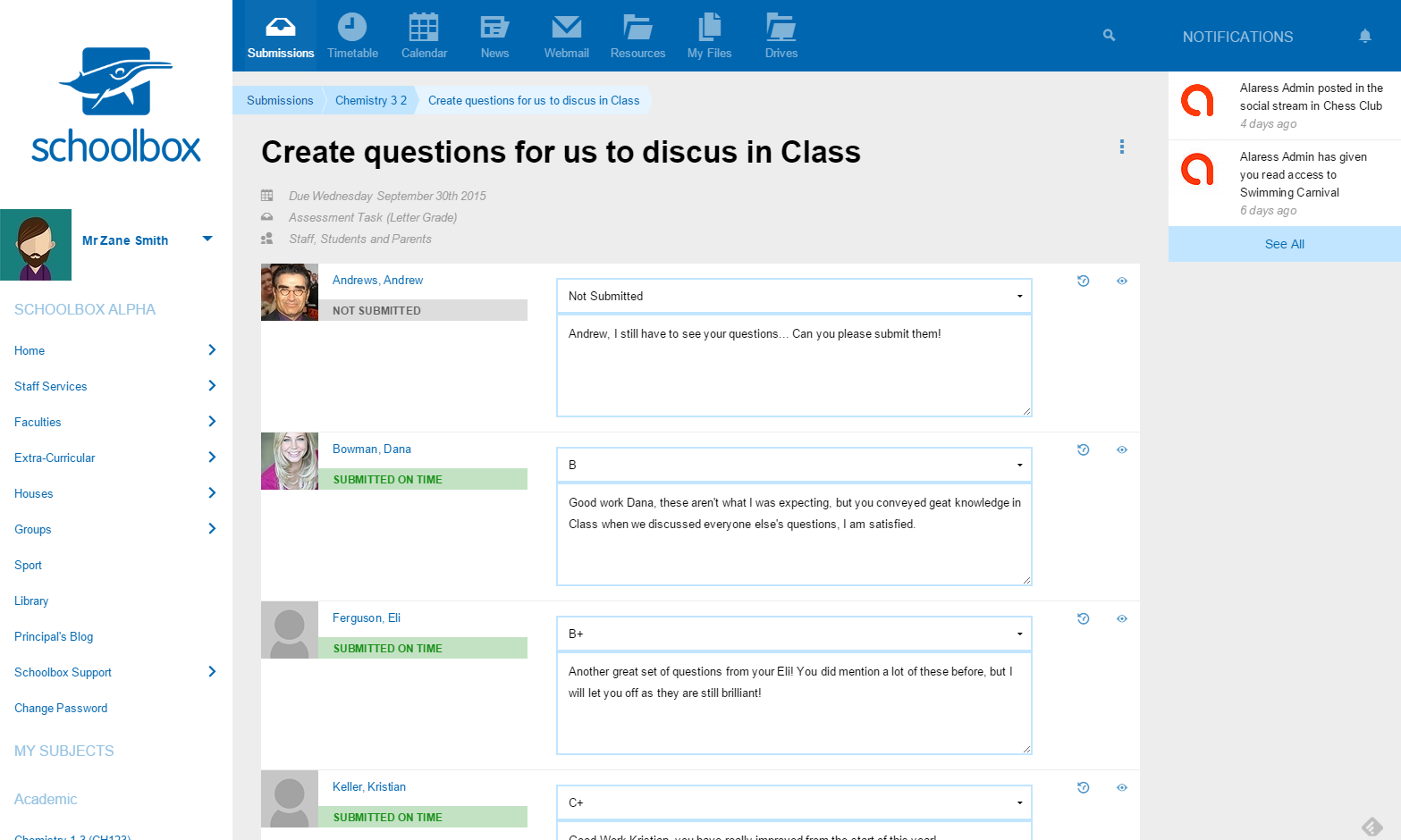
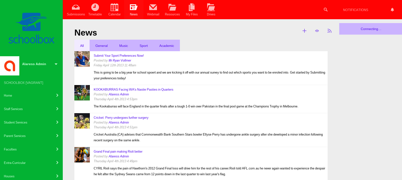
In the process of upgrading the navigation system we recognised that many users were already familiar with our existing navigation system. So rather than completely replace the existing well known system we choose to evolve the system. This means the tab bar has been converted to a button list for easy pressing on touch screens. The button list also overflows into the side navigation when the screen size is limited. The side menu has been hidden off screen on small devices to maximise screen real estate. This navigation will easily be accessible under the ‘hamburger’ icon in the top right while on mobile.
We have also move notifications into their own column on the right hand size. On small screens this remains off-screen until summoned but on very large screens you will always be able to see the notifications, increasing the value of this important system.
While reviewing our interfaces we found that on small screens identifying your location became difficult. To help improve users knowledge of contextual location we have added breadcrumbs to many features. This should help users understand their location and also navigate back to where they came from.
Touch Friendly
As part of this review, we recognised that most mobile devices are also touch based devices. To support touch we increased the size and padding around elements to ensure users with large fingers could easily click on buttons and links. Additionally we reviewed our drag and drop systems and made them more fool proof when using your fingers.

Skin Builder
With the new interface, all old customised skins cannot be easily migrated into the new system. To help you migrate quickly and easily we have created a new skin configuration. This will enable you to configure all the colours, images and logos used in the new interface. Please read the instructional tool tips to see which colour affects each element and be aware it may take up to 5 minutes for the changes to appear. By default the system will continue to use your existing skin, however be aware that this will be a mix of the old interface and the new interface and may not function entirely correctly. We do recommend that you migrate to the skin builder, by enabling it in Admin > Settings > Skin Config.
If you find yourself limited by the skin builder let us know and we can extend its functionality or build you a new custom skin based on the responsive interface.
Engagement Report
We recognise that providing the best support for Schoolbox requires insights into how the system is being used. These new reports are designed to help Schoolbox admins understand and execute targeted PD and monitor KPIs. We have been using this data internally for some time to increase the effectiveness of our deployments, so we hope it can now help you do the same. These reports are designed to give an overview of who is using Schoolbox and how they are using it. Insights into login rates, LMS usage, homepage components are all available in a single simple interface.
Known Issues
- Custom skins built on the old platform may not work correctly. We recommend you migrate to the skin builder and build a new skin on the new platform
- Custom modules built on the old framework will need to be migrated to the new framework. Please contact us for assistance migrating your custom features to a new mobile responsive design
