A sneak peek at what we’ve been building over the last 2 years
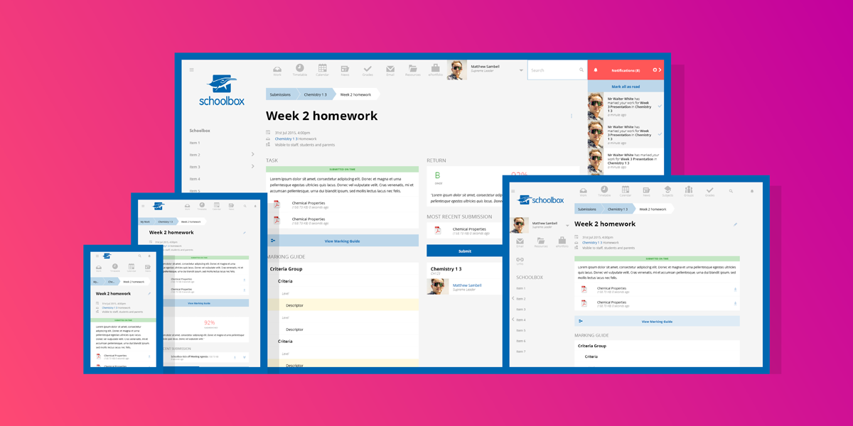
Feature Image: Screenshots of new responsive Due Work History page.
The Portal
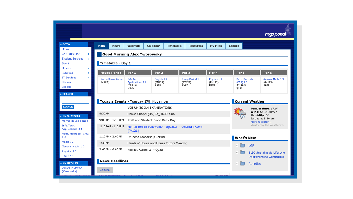
In the beginning, James Leckie built Schoolbox for all to enjoy. His early vision was an intranet and portal combo, purposely built for a K-12 school. James referred to his creation as ‘The Portal’. It had no learning management system and was a developer inspired tool – smart and sensibly dressed.
Screenshot of Portal (2002).
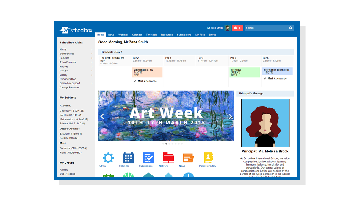
A lot’s changed since then – computers are phones and teaching and learning is delving deeper into a digital dimension. All the while, The Portal has been under constant improvement. New LMS features grew, workflows evolved, and interfaces sharpened to transform The Portal into Schoolbox.
Screenshot of Schoolbox v15 (2015).
Audit And Rebuild
It’s been a long journey, and the time has come to evolve Schoolbox for modern devices. Schoolbox’s new responsive web design will include a modern clean design and all the features you’ve come to love. The new design will make Schoolbox available on your mobile device with touch-friendly user interfaces.
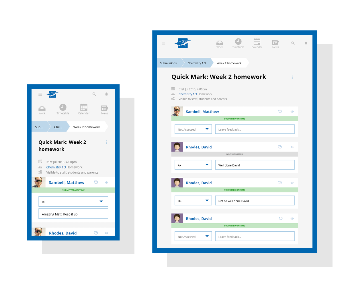
Screenshots of responsive Quick Mark on a smartphone and iPad portrait (CONCEPT ONLY).
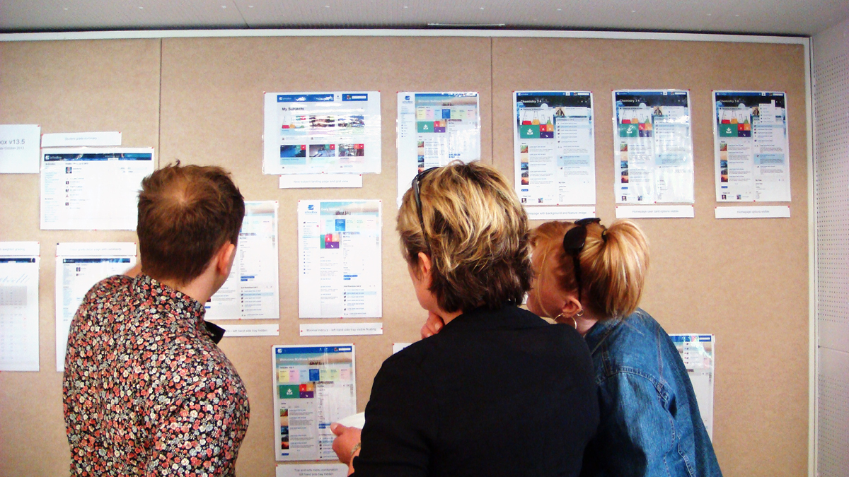
In 2013 we hinted towards such improvements by showing off concepts at our meetup. Since then, our team has been busily rebuilding Schoolbox. This release was aimed for May 2015, but we held off for further tweaking to ensure the best release ever!
Showing off new design concepts at the 2013 Schoolbox Meetup.
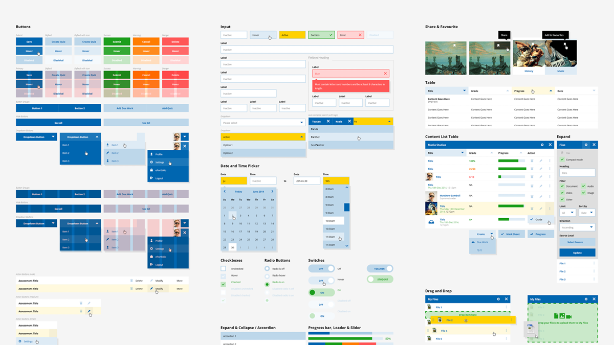
We began by designing a ‘boilerplate’ – a complete itinerary of every page element. We refer to this as our ‘pantry’, as it contains all of the ingredients that make up Schoolbox.
Snapshot of the “Pantry”
Next, we identified key pages for redesign and served them up with our fresh ingredients. We used a design technique called ‘mobile first design’, to ensure each interface made sense on a mobile screen before reformatting it to the next device size up. This technique also helps ‘stock-take’ each page’s anatomy, highlighting further ways to simplify and improve.
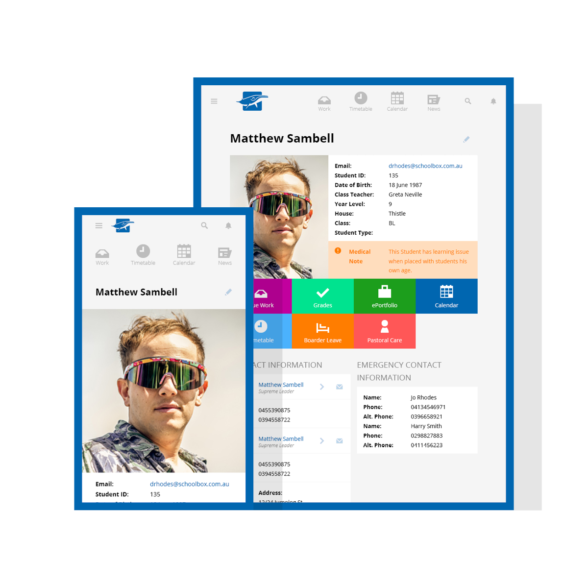
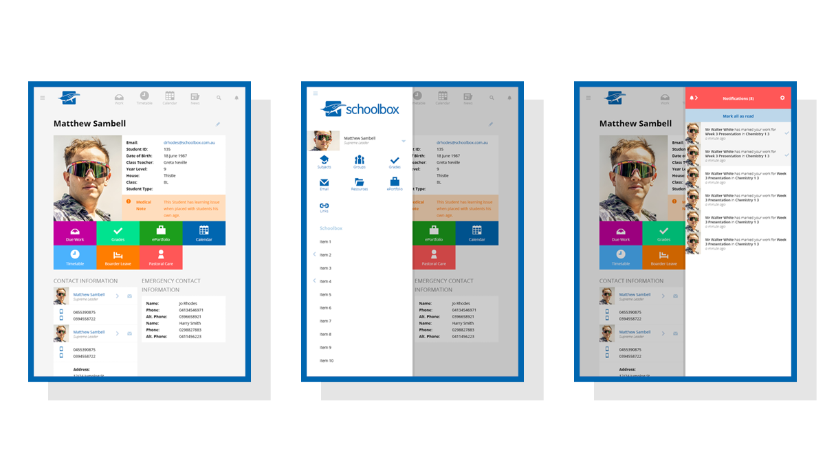
Other improvements to look forward to are clear hierarchy of headings, better defined content through ‘cards’ design, support for high DPI displays, icon based navigation, and a visible notifications tray for widescreen. We also have a plan for porting your skin over to the new look and feel 🙂
Screenshots of the Profile page using ‘card’ design technique to help organise information (CONCEPT ONLY).
So, stay sharp, eyes peeled, and devices ready, in preparation for Schoolbox Responsive and its improved workflows for teaching and learning.
